

Colours and architecture
Psychology of colours in architecture: principles and applications
Colour changes the perception of a space, underlines boundaries, helps with orientation and contributes to an atmosphere. Its effects, however, depend on light, materials, proportions, cultural context and the people involved. The psychology of colours applied to architecture therefore benefits from moving away from tables of universal meanings to become a method of observation and composition.
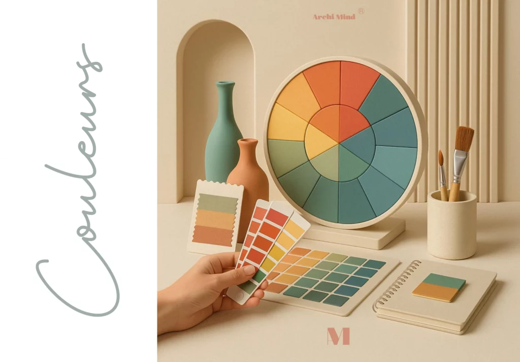
Perceiving a colour within a system
A colour is never perceived on its own. Its lightness, saturation and neighbouring colours change its appearance. The same sample can look warmer, darker or more intense depending on the background and the lighting. Tests should therefore be carried out close to the final materials and on a sufficiently large surface.
Proportions matter too. A colour used on an entire wall does not produce the same presence as on a frame or a piece of furniture. Before discussing symbolism, it is necessary to analyse the quantity, position and contrast involved.
Natural and artificial light
Orientation, weather and time of day transform colour. A north-facing room receives different light from a room exposed to direct sun. Artificial sources add their own spectrum and intensity. Photographing a sample is not always enough, since the screen and the camera in turn change the rendering.
A simple method is to move large samples around and observe them in the morning, afternoon and evening. Night-time uses should be tested with the planned lighting. This sequence reduces surprises and reveals the interactions with floors, textiles and joinery.
Colour, volume and legibility
Contrasts can accentuate depth, visually bring a surface closer, or make a boundary more legible. They can also help distinguish a door, a step or a functional zone. These effects remain relative to the layout and do not replace regulatory accessibility requirements.
Chromatic continuity can link several spaces, while a break marks a transition. The choice depends on the intended route. In a small volume, multiplying breaks can fragment how it reads; in a larger ensemble, they can instead provide landmarks.
Atmosphere and individual differences
Emotional associations vary with experiences, cultures and contexts. Presenting blue as always calming or red as always stimulating ignores these differences. A colour can bring to mind an institution, a landscape, a brand or a personal memory. Dialogue with the people who use the space remains essential.
In a collective project, it is possible to work towards observable objectives: making a zone identifiable, reducing a glaring contrast, creating continuity, or supporting the identity of a place. These objectives are more debatable and verifiable than an absolute emotional promise.
Building an applicable palette
A working palette specifies roles: main background, secondary surfaces, accents, signage and existing materials. It takes into account upkeep, ageing, finishes and installation conditions. References should be kept together with the validated samples.
Models, elevations and simulations help distribute colours, but the real sample remains decisive. The psychology of colours training develops this interplay between perception, light, material and spatial application.
In conclusion
Applying the psychology of colours in architecture means composing with a context, not stamping on a meaning. A palette becomes relevant when it answers the uses, stays legible in real light, and can be explained. For a targeted choice, tailored support can focus on colours and materials.