
Neuro-Architecture
Perception and overall experience of the built environment.
 The quality certification was awarded for the following categories of action:
Professional training · Online
Observe, compose and justify the use of colour in a space, taking perception, light and context into account.
Colour does not produce an identical reaction in everyone. The path connects its visual characteristics to materials, uses, the environment and the people concerned.
What we mean
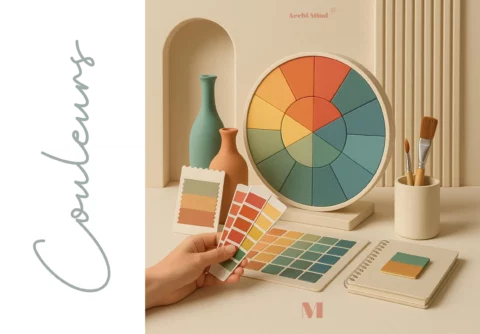
In the Archi Mind approach, Psychology of colours studies the relationships between colour, perception, emotion, behaviour, culture, identity, environment and the function of a space.
A reaction is neither uniform nor automatic. It varies with hue, saturation, brightness, contrast, light, materials, the surface area covered, uses, personal history and cultural references.
The path distinguishes visual perception, cultural associations, individual preferences, professional uses, symbolic interpretations and scientifically established knowledge.
Three complementary angles
Perception and overall experience of the built environment.
Subjective relationship between a person and their living space.
Use, perception and meaning of colours in a given context.
Who is the training for?
These profiles are concerned depending on their activity, their scope of competence and their project.
Questions studied
Each choice is observed in its environment, without any guaranteed emotional or behavioural result.
Combine colours coherent with the identity, function and constraints of the project.
Compare how a colour changes under natural and artificial lighting.
Take texture, finish, surface and neighbouring colours into account.
Question the activities, needs and environment of the place.
Gather the history, references and reactions expressed by occupants.
Distinguish observation, intention, symbolism and level of evidence within a recommendation.
Learning objectives
The objectives favour verifiable actions rather than universal effects attributed to colours.
Observe the components of a chromatic atmosphere and their relationship with the space.
Distinguish visual perception, cultural associations, individual preferences and symbolic interpretations.
Analyse the interactions between hue, saturation, brightness, contrast, light, materials and surfaces.
Compare a colour across different environments and depending on the uses of the place.
Gather the needs, preferences and constraints expressed by occupants or the client.
Compose a palette coherent with the function, identity and context of a space.
Justify a colour recommendation without attributing a universal or therapeutic effect to it.
Intended capabilities
These capabilities do not constitute an officially certified professional skill.
Describe the colours, contrasts, light, materials and their context.
Compose a proposal coherent with the uses and the project.
Listen to preferences, constraints and references without reducing them to a standard profile.
Present a recommendation while separating intention, perception and symbolism.
The programme, in detail
These topics connect the characteristics of colour, its context and its application within a space project.
Teaching approach
The exact organisation and any support time depend on the published session.
Discover the Academy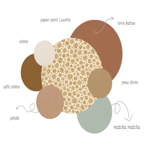
Reading a palette
Names, flat colours and materials make a palette legible without relying solely on colour perception. The same shade changes depending on the light, its surface, its substrate and the colours surrounding it.
Working with colour therefore means comparing, testing and documenting choices under the actual conditions of the project.
Professional applications
Compose a palette in relation to occupants’ uses and preferences.
Connect atmosphere, function, identity and work constraints without promising a productivity gain.
Work on coherence between the identity of the place, the route and legibility.
Justify chromatic choices in relation to light, materials and volumes.
Distinguish brand intention, cultural associations and the context of reception.
Address contrast and wayfinding with caution, drawing on the appropriate skills.
What this is not
Blue does not always calm, red does not automatically make people aggressive, and a colour does not define a personality. Individual preferences, cultural references, context and visual conditions all matter.
This training is neither medical nor a colour therapy. It does not train people in chromotherapy. Any application related to disability, health or sensory disorders requires caution and suitable professional skills.
How it works
Training accessible online with content assigned in the Academy.
Visual materials, exercises, case studies and quizzes are documented.
Quizzes are confirmed. No certificate or certificate title is published without validation.
An adaptation can be discussed in advance based on needs linked to a disability.
Up-to-date information is published on the dedicated page.
See the sessionsThe student space gathers the courses and documents assigned after enrolment.
Go to the AcademyQuality and funding
Archi Mind is Qualiopi-certified for training activities. This certification is neither a personal certification for the participant, nor a scientific validation of the content, nor a funding guarantee.
Depending on your situation, funding support can be discussed with your employer, an OPCO or as part of a skills development plan. It depends on the scheme, the file and the funder’s agreement. Trainings are not currently eligible for CPF funding.

The trainer
After experience in real estate, Mathilde Morel trained in interior decoration, Neuro-Architecture, and the Psychology of colours and of the home.
With Archi Mind, she connects design practice to observing light, materials, colours and the needs expressed around places.
Discover her backgroundSpecific FAQ
The answers distinguish the professional uses of colour from universal formulas and from chromotherapy.
See the general FAQNo. The path also concerns well-being professionals, managers and people wanting to deepen their use of colour. A prior conversation lets you check whether it suits your activity and project.
No. A reaction depends in particular on the shade, the light, the materials, the surface, the environment, the uses, personal history and cultural references. Symbolic interpretations are distinguished from established knowledge.
Neuro-Architecture addresses the perception and overall experience of the built environment. Psychology of colours focuses on the use, perception and meaning of colours in a given context.
Psychology of the home first looks at the subjective relationship between a person and their living space. Psychology of colours more specifically studies colour, its interactions and its integration into a space project.
No. It does not train people in a medical practice or colour therapy, and it does not allow a colour to be used to treat a condition.
Colour is observed together with natural and artificial light, materials, contrasts, the surface area covered and other elements of the environment.
Yes, the sources mention design, decoration and professional environments. Any recommendation must, however, be adapted to the uses, the context and the people concerned.
The online format, visual materials, exercises, case studies and quizzes are confirmed. The up-to-date organisation and the content assigned in the Academy depend on the session chosen.
Depending on your situation, funding support can be discussed with your employer, an OPCO or as part of a skills development plan. It depends on the scheme, the file and the funder’s agreement. Trainings are not currently eligible for CPF funding.
Contact Archi Mind before enrolling to discuss your needs. Any application related to disability, health or sensory disorders requires caution and suitable skills.
Your next step
Find up-to-date information or check whether the path suits your project.