

Colours and architecture
Light, materials and colours: understanding their interactions in an interior
In an interior, colour is not an independent layer. It appears through a lit material. A matte surface diffuses light, a lacquer reflects it, a textile creates fine shadows, and wood varies its shade according to the grain. Designing the atmosphere therefore requires observing the trio of light, material and colour as a system.
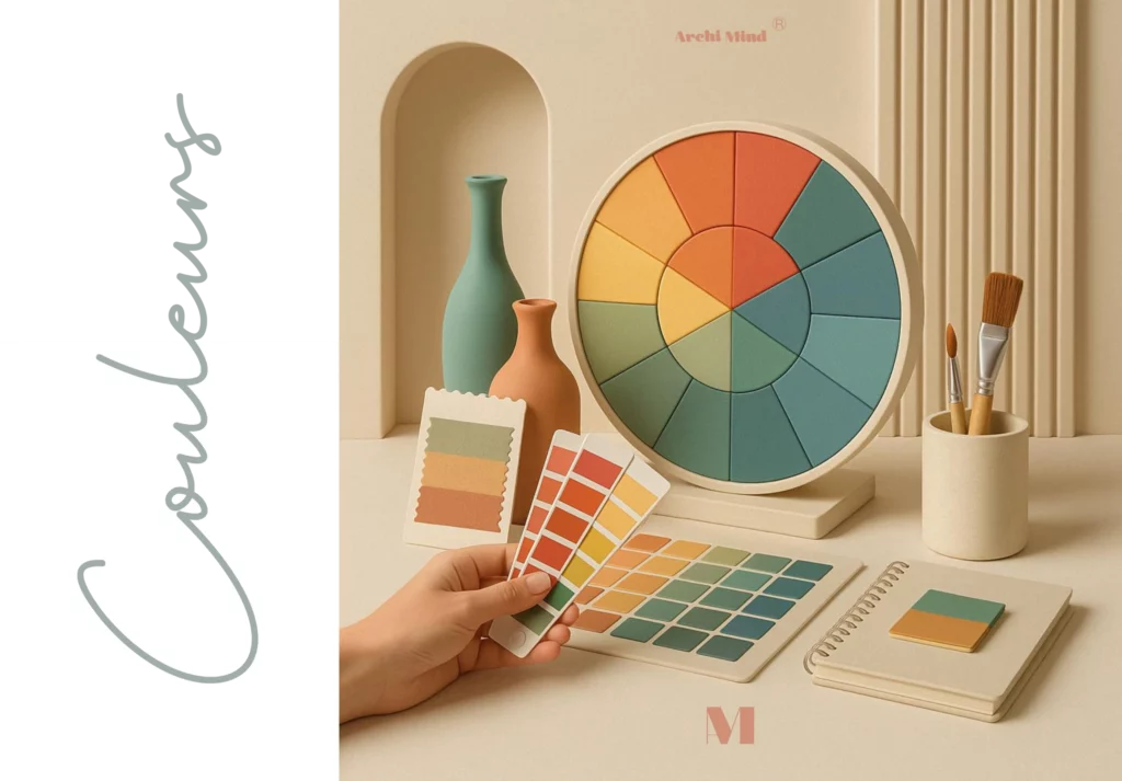
Light reveals as much as it transforms
Raking light accentuates relief and flaws, while diffuse light softens contrasts. The distance and angle of a light fitting change the perception of the same paint. Natural orientation adds variation throughout the day. These phenomena should be observed on the final surfaces or on representative prototypes.
The goal is not to remove all variation. It can add depth and bring a material to life. Instead, it is better to avoid effects incompatible with the use, such as a distracting reflection on a worktop or a contrast that hides information.
Matte, satin, gloss: different behaviours
A matte finish absorbs more of the visible reflections and can produce a deep colour. A glossy finish reflects the surroundings and varies with the viewing angle. Between the two, satin finishes offer a compromise between upkeep and presence. The choice depends on the surface, the level of use and the desired effect.
Preparing the substrate is decisive. Side lighting reveals irregularities, especially on a taut finish. The aesthetic choice must therefore be coordinated with technical constraints and the achievable level of finish.
Textures and scale of perception
A fine texture reads up close; a larger-scale pattern influences perception from a distance. Textiles, renders and wood grains introduce several values within the same colour family. They can either connect shades or, conversely, increase visual complexity.
The scale of the pattern should be compared to the dimensions of the room and the furniture. A sample that is too small hides repetitions. Laying the material out over a large surface or using a scale simulation helps anticipate this effect.
Build useful contrasts
Contrast in lightness makes it easier to distinguish certain elements. Contrast in texture separates two surfaces that are close in colour. These tools can support how a space reads, but their effectiveness depends on lighting conditions and on the people involved. Accessibility obligations must be checked against the applicable regulatory context.
A strong contrast draws attention. It is therefore useful to decide what deserves that role: an entrance, an artwork, information, or a particular volume. Too many focal points cancel out the hierarchy and can make the whole feel restless.
Prototype a complete atmosphere
A materials board becomes more reliable when observed under light comparable to that of the project. Place the samples in their future orientation: a flooring sample flat, a wall sample upright. Add the planned artificial sources, and use photographs only as a memory aid.
For important decisions, an on-site sample or a test area remains preferable. The Psychology of colours training provides reference points for arguing these choices without isolating the shade from its environment.
In conclusion
Light, material and colour change one another. A coherent atmosphere comes from tests carried out in situ, a clear hierarchy and attention to uses. This method avoids asking a single colour reference to solve a question that actually concerns the whole spatial system.