

Colours and architecture
How to choose the colours of a space without only following trends
Trends offer references and spark the imagination, but they know neither the orientation of a room nor the habits of its occupants. A colour that looks appealing in a photograph can become dull, overpowering or hard to pair in another context. Choosing for the long term means starting from the place, the elements being kept, and the experience sought.
Start with what will not change
Flooring, joinery, stone, major furniture and the outdoor view are the first reference points. Their undertones and textures influence the palette. Ignoring them later forces multiple corrections. A photographic inventory and samples gathered on site create a more reliable base than an isolated inspiration board.
Upkeep and installation constraints must also be noted. A very matte finish does not have the same durability or rendering as a satin finish. The substrate, preparation and quality of application all contribute to the final result.
Define the role of each colour
A palette does not just provide a list of shades. It specifies where and why they come into play. A dominant colour builds the background, a secondary colour accompanies certain volumes, an accent draws attention to a chosen element. Without this hierarchy, several beautiful shades can end up competing with each other.
The role can be functional: distinguishing a zone, accompanying a route, or improving the visibility of a piece of equipment. It can also support the desired identity. In every case, the quantity and position must be tested.
Test in the light of the place
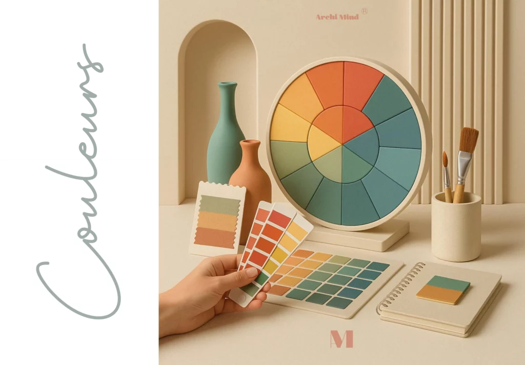
Small colour charts are useful for shortlisting, not for validating. Painting a large, movable board makes it possible to compare several walls and several times of day. Directly lit zones, shadows and the evening under artificial light should all be observed.
Screens do not render colours faithfully. A digital reference should always be linked to a manufacturer reference and a physical sample. Even then, the substrate and the number of coats can change the result.
Take duration and change into account
A shade chosen for a trend can remain relevant if it truly matches the place and the occupants’ tastes. The question is not to avoid every trend, but to understand what is appealing: warmth, contrast, naturalness, depth or memory. This motivation can be translated into a personal palette.
Elements that are easy to change accommodate more experimentation. Textiles, accessories and small pieces of furniture allow the atmosphere to evolve, while costly surfaces can receive more stable choices. This distinction reduces the fear of getting it wrong.
Compare complete scenarios
Rather than comparing two colours on their own, build two scenarios with flooring, wall, textile, wood and light. Each scenario should meet the same objective so the comparison is useful. An annotated photograph or an elevation helps discuss proportions.
The final decision can be documented with the references, finishes and surfaces concerned. This rigour makes purchasing and execution easier. To structure this practice, see the Psychology of colours training.
In conclusion
A durable colour is not necessarily neutral: it is connected to the place, the uses and the materials. Trends then become one source among others, not an instruction to follow. A coherent project also leaves room for change without calling the whole composition into question.